
Advanced chart reading

You are three candles into a setup on the fifteen minute chart. Volume picked up, the level held, and the trade is doing everything you asked of it. You never checked the four hour chart before you clicked buy, because the setup looked complete on its own.
Two hours later you finally scroll out and see it. The whole trade sat inside a wide resistance shelf on the four hour chart, a shelf that has turned price back three separate times over the past month. Nothing on the fifteen minute chart could have shown you that shelf. It was never missing information. It was information you never opened.
The idea in plain words
Trading across multiple timeframes means reading the same instrument on more than one chart interval and giving each chart a separate job, rather than flipping through several charts hoping one of them agrees with the trade you already want. Three charts, used with three different jobs, cover almost everything a single chart cannot.
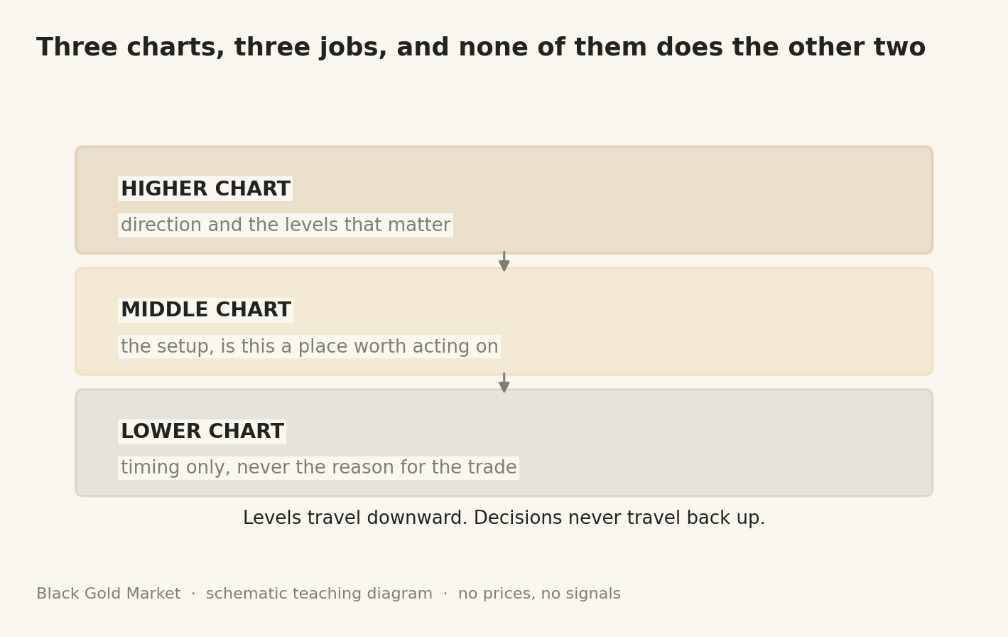
The highest chart in the stack answers one question, direction and levels. It tells you whether the broad trend is up, down or sideways, and it holds the two or three widest zones where price has turned before, the kind of zones covered in Support, resistance and structure. You do not enter or exit from this chart. You use it to decide which side of the market you are even allowed to trade today.
The middle chart is where the actual setup lives. This is the timeframe you would call your trading timeframe if someone asked, the one where a pattern, a pullback or a retest either does or does not form inside the boundaries the higher chart already gave you. The lowest chart in the stack has one job only, timing. It exists to fine tune the exact candle you act on and to tighten the stop, not to argue with the direction the higher chart already set.
The gap between the three intervals matters more than most traders realize. Pick two chart intervals that sit close together, and the lower one mostly repeats the higher one, candle for candle, so a second look feels like confirmation while actually being the same data twice. A useful stack needs charts spaced widely enough that each one shows something the others cannot, normally somewhere around six to eight times longer per step up, so that a full swing on the lower chart barely registers as a dent on the higher one.
A worked example
This is a hypothetical illustration with made up numbers, not a trade signal.
Say you build a three chart stack for a gold setup using four hour candles on top, thirty minute candles in the middle and five minute candles on the bottom. The four hour chart is two hundred forty minutes per candle, so divide two hundred forty by thirty and each four hour candle contains eight of the middle chart's candles. Divide thirty by five and each middle chart candle contains six of the bottom chart's candles. Both steps land in that six to eight range, wide enough that each chart is doing its own job rather than repeating the last one.
Compare that with a trader who instead picks a five minute chart and a fifteen minute chart as their two intervals. Fifteen divided by five is three, so sixteen five minute candles and four fifteen minute candles both cover the same hour of trading, and a trend line drawn on one chart is barely different from a trend line drawn on the other. Two charts that close together are mostly showing the same data twice, dressed up as two separate opinions agreeing with each other.
Back on the eight to one stack, one ordinary looking four hour candle can contain a full round trip on the thirty minute chart, price rising then falling and still closing the four hour candle only slightly higher. A trader watching only the thirty minute chart would have felt that whole swing as real movement worth reacting to. A trader reading the four hour chart for direction saw one unremarkable candle. That difference is the entire reason the higher chart exists, to hide the wiggle that would otherwise shake a position out of a trend that never actually changed.
The three chart roles
| Chart | What you look for | What you must not do here | What it decides |
|---|---|---|---|
| Higher, direction and levels | Overall trend and the two or three widest zones price has respected | Do not enter, exit or set a stop directly from this chart | Whether you are even looking for longs, shorts or nothing today |
| Middle, the setup | The specific pattern or retest forming inside the higher chart's boundaries | Do not redraw the higher chart's levels to make today's pattern fit | Whether a valid trade idea exists at all, and its rough entry zone |
| Lower, timing | The trigger candle or moment for a tighter entry and stop | Do not use it to override the direction the higher chart already set | Only when to act, never which direction or whether to act at all |
Where people go wrong
- Redrawing the higher chart to fit a trade already wanted. A trader marks a resistance zone on the four hour chart on Monday, then on Thursday, itching to buy, nudges that same zone up just a little so the current price sits comfortably below it. The zone that was supposed to warn against a bad entry has been edited into agreeing with one, so it stops doing its job entirely.
- Trusting the hindsight trap. Scrolling back over three months of daily candles shows a smooth trend that looks obvious from the first candle. Nobody trading that chart in real time had those later candles to look at yet, so the trend felt uncertain the whole way through. Judging today's uncertain, half printed chart against yesterday's fully printed, obvious looking one makes a normal decision feel like a failure before it has even played out.
- Opening a fourth and fifth chart until one agrees. When the first two charts in a stack do not support a trade, adding a third close interval chart rarely adds real information, since a chart that sits close to one already open is mostly repeating it. What it adds is one more source to search through until something, anything, looks like permission to take the trade already decided on beforehand. More charts is not more information, it is usually more excuses.
Your turn
- Pick one instrument you already follow and open three charts of it, spacing the intervals roughly six to eight times apart, for example daily, four hour and thirty minute.
- On the highest chart only, write down the current direction and mark the two widest zones price has respected. Do not touch this chart again for the rest of the exercise.
- On the middle chart, write down in advance exactly what pattern would count as a valid setup, using the zones from the highest chart as its boundaries.
- Only if that setup appears, drop to the lowest chart and note the exact candle you would have used to time an entry and place a tighter stop.
- At the end of the day, scroll the highest chart back one week and compare how obvious the trend looks now against how uncertain that same stretch felt while it was still printing.
Check yourself
What is the job of the highest chart in a three chart stack
It sets direction and holds the widest levels, the two or three zones price has respected before. It is not used for entries, exits or stops, only for deciding which side of the market is worth looking at.
Why should the intervals in a chart stack be spaced widely apart instead of close together
Charts with close intervals, like five minutes and fifteen minutes, cover almost the same candles, so the second chart mostly repeats the first rather than adding a genuinely different view.
What is the hindsight trap and why does it matter
It is the illusion that a trend was always obvious, created by scrolling back over candles that have already finished printing. It matters because a live decision only ever has half the candles a review has, so comparing the two unfairly makes ordinary uncertainty feel like a mistake.
A three chart stack changes what you look at, not how you read any single candle on it. The next lesson, Heikin Ashi, waves and harmonics, looks at a candle type built to filter out exactly the kind of noise a normal candle stack cannot avoid on its own.