
Chart foundations

Price on your chart keeps stopping at almost the same spot. You watch it happen three times, so the fourth time you drop a limit order right on that number. Price stops six ticks short and reverses without you.
That gap between the number you marked and the number price actually respected is the whole lesson. A level is not a single price, it is a small area where buyers and sellers keep changing their minds. Trade it like a laser line instead of a zone, and the market will keep almost tagging your order and leaving you standing at the door.
The idea in plain words
Support is a zone where buying has shown up before, strong enough to slow or turn a decline. Resistance is the same idea in reverse, selling strong enough to slow or turn an advance. Neither lines up at one exact tick, spreads shift and wicks land differently each visit. Treat a level as a band with a top and a bottom, not a single price, and most fake bounces and fake breaks stop looking fake.
Structure is the shape those turning points draw across time. A swing high is a candle whose high sits above the candles on both sides of it, a local peak. A swing low is a candle whose low sits below the candles on both sides of it, a local trough. Higher highs with higher lows describe an uptrend, each pullback holding above the last. Lower highs with lower lows describe a downtrend, the reverse. Swings without a clear run of higher or lower points describe a range, price bouncing between a rough ceiling and floor.
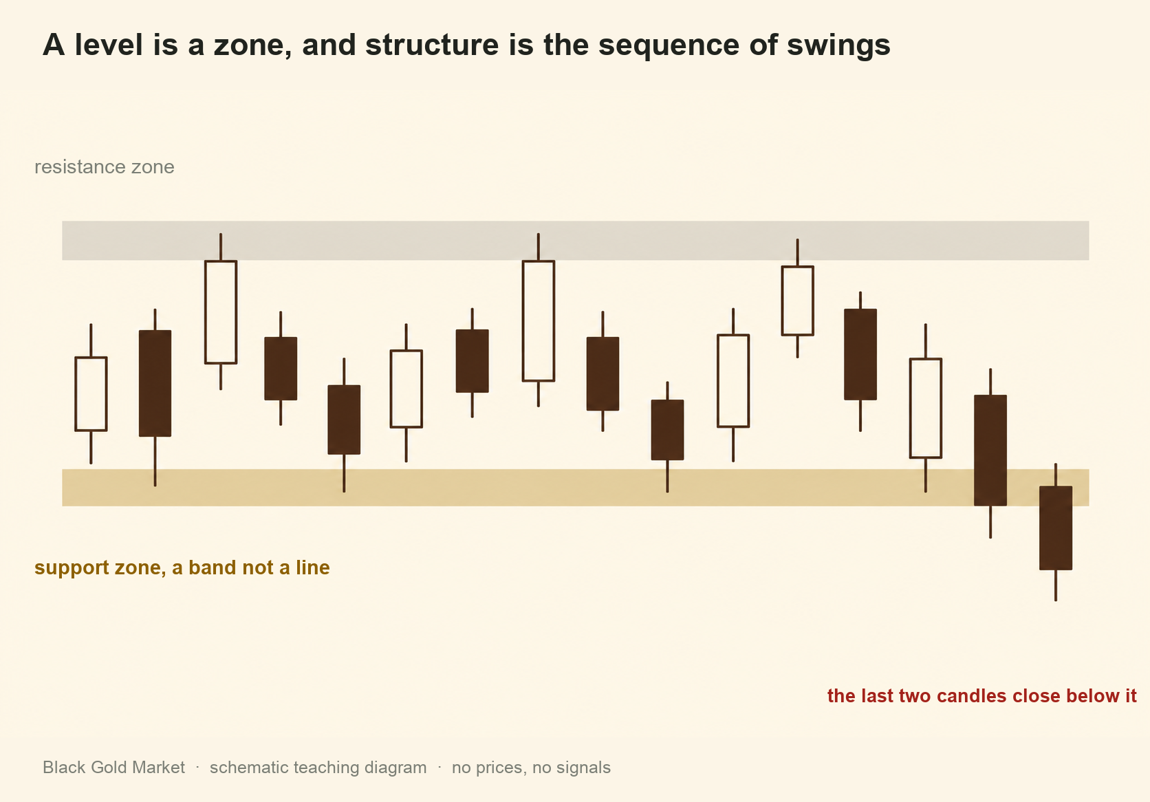
A level that breaks tends to get retested from the other side before the move continues. Traders who bought near an old floor and are now underwater often want out at breakeven, so their exit orders sit back near that floor and act as fresh selling when price returns. Traders who missed the break also treat the old floor as a new ceiling worth selling into. That is not guaranteed on any single break, but it happens often enough to wait for the retest instead of chasing the first move.
Mark zones from the top of the timeframe stack down. Start on the daily or four hour chart and note where price has turned more than once, those are the levels the widest group of participants is watching. Drop to your working timeframe only to time entries around zones you already trust, not to invent new ones. There is also a point where more levels stop helping. A chart with a line every few dollars tells you nothing, because price is always near one. A workable chart holds a handful of zones you could describe from memory. If you cannot say why a zone is there, take it off.
The definition worth keeping is a testable one. A level is only useful if you can say in advance what would prove you wrong about it, the exact condition that breaks the zone, such as a four hour candle closing beyond its far edge. Write that condition down before price gets there. Deciding that only after the fact is not reading structure, it is describing what already happened.
A worked example
This is a hypothetical illustration with made up numbers, not a trade signal.
Say you are tracking an instrument on the four hour chart. Over three weeks it prints swing lows at 118.00, 121.00 and 124.00, each above the last, so structure reads higher lows. The swing highs print at 132.00, 136.00 and 141.00, also each above the last, higher highs with higher lows, an uptrend.
Look at that first swing low near 118. Price touched 118.20, then 117.60 on a later visit, then 118.00 on a third touch, three touches inside a 60 cent range. That range, not any single number, is the zone. Add a 30 cent buffer on each side and the working zone runs from 117.30 to 118.50. Set the invalidation rule now, a four hour candle closing below 117.30, so you know what wrong looks like before it prints.
Marking levels top down
| Timeframe | What you mark there | Why it carries weight |
|---|---|---|
| Daily or weekly | The two or three widest zones price has respected for months | Watched by the most participants, slowest to break |
| Four hour | Zones inside the daily range where several swings cluster together | Good balance of context and detail for planning a trade |
| One hour or lower | Fine tuning of entry timing inside a zone already confirmed above | Too noisy alone, useful only for timing entries |
Where people go wrong
- Drawing a hairline instead of a zone. A single price line looks precise, so the trader parks a stop a few ticks behind it. Price wicks through, stops the trade out, then reverses as expected, and the level gets blamed for what the drawing caused.
- Marking bottom up. Starting on a five or fifteen minute chart marks a level almost anywhere price paused, since low timeframes pause constantly. The chart fills with lines nobody else watches, and none hold up once a larger move arrives.
- Moving the goalposts after the break. A trader calls a zone support, price closes straight through it, and only then decides it was never real. Without a condition set beforehand, every outcome can be explained away, and nothing was actually tested.
Your turn
- Open the daily or four hour chart of an instrument you follow and mark two or three zones where price has turned more than once.
- For each zone, write a top price and a bottom price, not one single number.
- Next to each zone, write the exact candle close that would prove it wrong, decided before price gets there.
- Drop to your normal trading timeframe and check whether the same zones still line up with turning points there.
- Count your zones. If you have more than five or six, remove the weakest until you are left with levels you could describe from memory.
Check yourself
Why do traders treat support and resistance as zones rather than exact lines?
Because price reacts inside a range, not one repeated tick. Spreads shift and wicks land differently each visit, so a precise line invites false signals that a wider band would absorb.
What turns a former support level into resistance after it breaks?
Traders who bought above the broken level are underwater and want out at breakeven, so their exit orders sit near the old floor and act as fresh selling. Traders who missed the break also treat that floor as a new ceiling worth selling into.
Why mark levels on a higher timeframe before a lower one?
Higher timeframe zones are watched by more participants and carry more weight. Marking on a low timeframe first risks anchoring on noise almost nobody else is watching.
Levels and structure show where price has reacted before. The next lesson looks at moving averages and trend, a way to read market direction without waiting for a level to prove itself first.