

The gold vs silver correlation is usually quoted as a single number in passing, somewhere between a half and a bit more, and then everyone moves on. I want to stop on it, because that single number is doing a job most traders have not asked it to do. It is quietly deciding how much risk they are carrying, and it is giving them the wrong answer at exactly the moment the answer matters.
The reason is simple enough to state and uncomfortable enough to sit with. Correlation is not a constant. It is an average of many different market conditions, and the conditions where it is high are not distributed evenly. They cluster on the days when everything is moving, which is to say the days when you were counting on your positions to behave differently from one another.
What Correlation Measures, and What It Does Not
Correlation measures how consistently two things move in the same direction at the same time, on a scale from minus one to plus one. Zero means knowing what one did tells you nothing about the other. One means they move in lockstep.
What it does not measure is size. Two instruments can be perfectly correlated while one moves three times as far, and correlation will not tell you that. It also says nothing about direction over time, so two markets can both drift upward for a decade and still show a modest correlation day to day. Both of those blind spots matter here, and both of them cut against the trader who is holding gold and silver together and calling it diversification.
What the Gold vs Silver Correlation Actually Measured
Rather than repeat a number I half remembered, I computed it from the published benchmarks.
The data is the LBMA gold and silver benchmark prices across the ten calendar years from 2016 to 2025. After matching the two series to sessions where both fixed, that leaves 2,505 shared sessions, and I measured the correlation of their daily percentage changes.
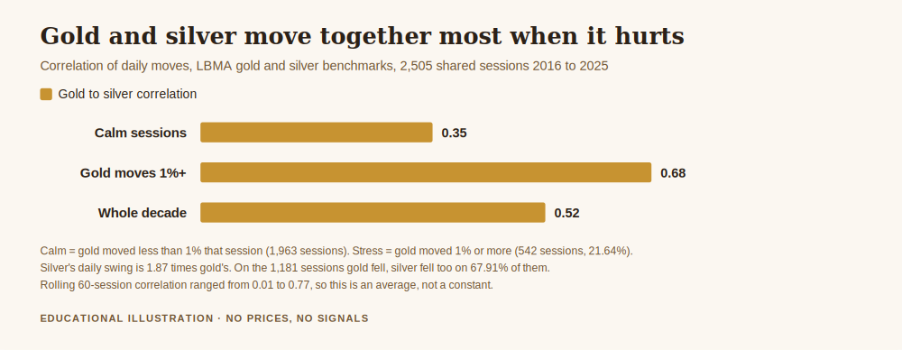
The answer for the full decade is 0.5170.
Taken alone, that looks like a reasonable diversification story. Slightly more than half a unit of shared movement, slightly less than half independent. It is the sort of figure that makes holding both feel prudent. The problem only appears when you stop averaging.
The Number Changes When You Need It Most
I split the same 2,505 sessions into two groups by how much gold itself moved.
On the 1,963 calm sessions, where gold moved less than one percent, the correlation between gold and silver was 0.3516. On the 542 sessions where gold moved one percent or more, which is 21.64% of the decade, the correlation was 0.6786.
That is a rise of 0.33 between ordinary days and violent ones, and the direction of the change is the whole point. Your diversification is strongest on the days you did not need it and weakest on the days you did. Nothing about that is unique to precious metals. It is a general feature of markets under stress, and it is the mechanism by which portfolios that looked balanced in a spreadsheet stop being balanced in a week.
A related figure makes it concrete. Across the decade gold fell on 1,181 sessions. On 802 of those, which is 67.91%, silver fell with it. Roughly two thirds of your bad gold days were also bad silver days.
The Second Problem, Which Is Size
Correlation is only half of the risk arithmetic. The other half is how far each instrument travels, and here the two metals are not close.
Silver's daily standard deviation over the period was 1.723%, against gold's 0.922%. Silver swings 1.87 times as far as gold, day in and day out.
Put those two facts together and the common version of this trade stops working. Suppose you split your capital evenly and put the same notional value into each. Running the portfolio arithmetic with the measured correlation and the measured volatilities, the combined daily standard deviation comes out at 1.169%, against 0.922% for holding gold alone.
Read that again, because it is the sentence this article exists for. Diversifying half your gold position into silver raised your daily risk by 26.71%. Not lowered. Raised. You added a second instrument, felt more diversified, and increased the amount your account moves each day by more than a quarter.
The cause is not mysterious. You replaced half of a calmer instrument with a much wilder one, and the correlation was never low enough to offset the difference in size. Diversification only reduces risk when the thing you add is both sufficiently independent and sufficiently well sized. Silver against gold fails the first test partially and the second one completely, unless you deliberately fix the sizing.
How Many Bets Are You Actually Holding
There is a cleaner way to see the cost, and it uses risk parity rather than equal notional, which is the sizing a careful trader would use anyway.
Size the two positions so each carries the same risk. If they were completely independent, holding two of them would carry the square root of two, about 1.414 units of single position risk, and you would genuinely hold two separate bets. If they were identical, you would carry 2.0 units and hold one bet wearing two names.
At the measured correlation of 0.5170, two equally risked positions carry 1.7419 units of risk. In terms of independence, you are holding 1.32 real bets, not two. About two thirds of a bet has quietly gone missing, and you are paying spread and financing on both positions for the privilege.
This is the same arithmetic that how to reduce drawdown in trading applies to several gold positions at once. What is added here is that the correlation is no longer an assumption. It is measured, on two instruments people genuinely believe are different.
The Days That Do the Damage
Averages hide tails, so it is worth naming the worst sessions rather than describing them.
On 16 March 2020, gold fell 4.81% and silver fell 17.79% on the same day. On 5 August 2024, gold fell 3.08% and silver 6.37%. On 2 February 2021, gold fell 1.60% while silver fell 7.64%. On 12 August 2020, gold barely moved at 0.40% down while silver fell 8.73%.
Two patterns run through those days. Silver's loss is consistently the larger one, often by a multiple. And the days themselves are the ones anyone would recognise, the shocks and the unwinds, which is precisely when a portfolio is supposed to hold together.
The single most useful sentence I can offer about this pair is that silver behaves like gold with the volume turned up, and the volume goes up furthest when the room is already loud.
One Honest Caveat
The 0.5170 figure is an average over a decade and should not be treated as a constant of nature.
Measured over rolling sixty session windows, the same correlation ranged from 0.008 at its lowest to 0.774 at its highest, with a median of 0.543. There were genuine stretches where the two metals moved almost independently, and stretches where they were nearly the same trade. Anyone planning around a fixed number, including the ones in this article, is planning around something that drifts.
That argues for the practical conclusion rather than against it. If the relationship between two instruments moves between roughly zero and roughly three quarters depending on the quarter, then sizing that only works at the low end is not a plan. The safe assumption for capital preservation is the stressed correlation, not the average one, because the stressed value is the one that arrives on the day the account is tested.
Get the free Black Gold Market blueprint, a short document for writing down what your open positions actually add up to before you add another one. One email, no spam, unsubscribe anytime.
Get the free blueprint →Frequently Asked Questions
What is the gold vs silver correlation, in one number?
Measured on daily moves in the LBMA gold and silver benchmarks across 2,505 shared sessions from 2016 to 2025, it is 0.5170. That average conceals a wide range, from 0.008 to 0.774 on rolling sixty session windows, so treat it as a description of the decade rather than a fixed property.
Does holding gold and silver together reduce my risk?
Only if you size for it. Splitting capital evenly by notional value raised daily portfolio volatility to 1.169% against 0.922% for gold alone, which is 26.71% more risk, because silver moves 1.87 times as far. Sizing both positions to equal risk instead does help, but less than it appears: you end up holding about 1.32 independent bets rather than two.
Why does correlation rise when markets fall?
Because stress tends to be shared. On calm sessions here the correlation was 0.3516, and on sessions where gold moved one percent or more it was 0.6786. When a single macro force moves both metals at once, the differences between them matter less than the thing they have in common, and diversification thins out precisely when it is needed.
Is silver just a leveraged version of gold?
Not exactly, since the correlation is nowhere near one and there were long stretches where the two moved apart. But as a rough working assumption for risk, treating silver as a more volatile relative of gold is closer to the truth than treating it as an independent instrument, and it is the safer of the two errors.
Where do these figures come from?
All of them are computed from the published LBMA gold and silver benchmark prices over the ten calendar years 2016 to 2025, matched to the 2,505 sessions where both fixed. The source is linked above so you can rebuild every number yourself. Nothing here comes from any account or any broker's data.
Does this mean I should only trade one metal?
No, and that is not a conclusion the data supports. It means the diversification benefit of adding the second one is smaller than it looks and disappears fastest under stress, so it should be sized on the stressed correlation rather than the average. Whether you trade one or both is a decision about your method, not about this number.
Would the answer change on a different period?
Almost certainly in magnitude, and the rolling range above shows how much it moves even inside this decade. What is unlikely to change is the direction of the effect, since correlations rising under stress is a general market behaviour rather than a feature of these two metals. Plan around the pattern, not the decimal.
Where This Leaves You
The gold vs silver correlation is not a fact to memorise. It is a warning about how diversification is measured, and the warning generalises well beyond these two metals.
Three things follow from the numbers above, and none of them require new software. Count your real exposure rather than your position count, because two correlated positions are not two bets. Size on the stressed correlation rather than the calm one, because the calm number will not be the one in force on the day it matters. And check whether the instrument you added to feel safer actually moves further than the one you already held, because if it does, you may have increased your risk in the act of trying to reduce it.
The wider framework this sits inside is how to protect your capital when gold gets volatile. The sizing discipline it depends on is in position sizing so one trade cannot hurt you, and the correlation arithmetic applied to a single instrument is in how to reduce drawdown in trading.
About the author. Raphael writes Black Gold Market. He works on the part of this business that happens before the trade, the level, the context, and the risk, and on the conviction that a method you can follow through a quiet quarter is worth more than a better one you cannot.
Disclaimer: This article is general educational content about measuring correlation and portfolio risk. It is not financial advice and it is not a recommendation of any instrument, allocation or position size. Trading gold, silver, CFDs and leveraged products carries a high risk of losing money rapidly. No entry, stop or target discussed should be treated as a signal. Every correlation, volatility and portfolio figure here is computed from the published LBMA daily gold and silver benchmark prices over 2016 to 2025, describes how those public benchmarks moved in the past, and applies to no account or broker. The risk parity and equal notional portfolios are stated arithmetic examples using those measured inputs, not recommended allocations. A historical relationship measured over one decade is not a forecast, and the rolling range quoted in the article shows how much it varies. No price levels are quoted anywhere in this article and no real trading results are represented.